Beauty surrounds us. It’s in the people we see. It’s in places we go. It can be as ornate as the details on a flower. Or, it can be as simple as a photo of a cup of coffee. It’s everywhere, and it’s tempting to capture it all to share. Can you share it all on your IG feed? You may want to think again. A creative Instagram feed design is necessary for your success online. It means that you can just drop every pretty photo on your feed. You have to be selective.
Like so many things in IG, there is a science to curating the perfect IG feed. Are you ready to learn about it? There may be a slight learning curve, but you’ll love the results. Plus, your Plixi social media gurus will break it down to the basics!

Table of Contents
First of All, What Is an Instagram Feed?
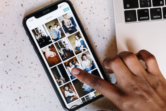
Before we get into the nitty-gritty, you need to have a clear idea of what an IG feed is. We told you we’re starting from the basics. What is an Instagram feed? We’ll explain. Your Instagram Feed is the main page of your Instagram profile. It’s where you go when you click on the profile icon. You’ll see your Instagram handle, bio, and photographs or reels that you upload on your IG feed. Your Instagram feed design appears in a tile or grid format. Regardless of the dimensions of the photo or video, the photos appear as squares.
If you see these photographs and videos here, they likely have shown up in feeds of not just your followers. IG may have shared them with people who don’t follow you as well. People who search the hashtags you use may see them, too. On your page, you’ll see which pieces of content you’ve pinned to the top of your feed. The Instagram feed design lets you see what piece of content is a reel or group of photos. You can access this page on both a phone and a desktop. Both will show three items per row. The most recent entry will go to the extreme left of the title design.

Learn How To Design an Instagram Feed That Suits Your Target Audience
A good Instagram feed design requires direction and planning. If you plan on honing in on a niche area, you should make sure your photos agree with that. We don’t mean to box you in, but maintaining a consistent aesthetic is important. One way to keep on track is to remember who you make content for. Who is your target audience? Also, remember your brand identity. Yes, your brand has an identity. Let’s discuss a few rules on how to design an Instagram feed.
Brand Identity
You decided on what your brand identity is, right? It’s what you stand for, the content you offer, and the visual aesthetic associated with it. Your company’s brand identification will indicate the kinds of content you can share on your IG feed. It will greatly contribute to how you decide what comes up on your feed. Beauty alone won’t be the criteria. It may also need to fit into a particular color scheme, too.
Check out some of your favorite creators. Think of how jarring it would be to put a particular color on that feed. Inately, you know what their brand identity is without them saying it. Your curated feed should be so defined that you know when something doesn’t belong. So, get rid of that random photo of the beach in Barbados. It clashes with the old building photos of you in London.
Target Audience
We have to consider the followers. Without them, we have no page. So, let’s keep them in mind before we post content. If they follow you for a certain aesthetic, why would you subject them to a jumpscare? Think about the grid layout that we were talking about earlier. They go to your feed and scroll like it’s a virtual magazine. They’ll know when something sticks out, like a tacky ad page. If your feed hasn’t decided on what it should look like, your targeted followers could get disgruntled. Don’t let that be you.
Post the kind of content that you think your ideal follower will like. Don’t derail from it. Your Instagram feed isn’t just some tile. It serves the primary function of attracting new customers to your IG page. Let them know right away what your page will give them. If you’re all over the place, they won’t truly know.
Just to make sure you produce content that your followers like, keep up with your Instagram Insights. That will tell you how well your content is doing.

Plan Your Instagram Posts To Secure a Good Feed
“Those who fail to plan plan to fail.” An Instagram page may appear to be free-spirited and relaxed. However, to be successful, a lot of planning goes on in the background. You can make sure your Instagram feed design comes out well with some planning.
Use a Calendar
Have you settled on a look for your Instagram account? That’s great. Sticking to it may be hard without proper planning. We suggest that you make use of a content calendar. This could be a sophisticated online program or the calendar on your phone. You just need something that will set out what you have to share next. Make sure to create content calendars that show dates well into the future. Maybe you have a quote post next or a blank color. Put it in the calendar.
Schedule Posts
In between your substantial posts, you can schedule simple posts. IG allows you to schedule posts long in advance. This helps with planning.
Use Drafts
If you have some inspiration, save the content in your drafts. Return to it and post it when it is time. Ideally, you want it to be the optimal time of posting. Be deliberate when sharing content, and your feed will show it.

Instagram Feed Ideas You Should Try Out
Maybe you agree that an Instagram feed design is very important. You just need some inspiration for your IG page. We’ve amassed some suggestions here. You’re bound to find a feed idea that works for you.
From these Instagram feed ideas, remember you need to maintain your brand consistency. You want to choose a theme and stick to it. The users should look at your feed and get a good idea of your brand identity.
Use the IG Grid the Right Way
When someone clicks on your handle, IG brings them to your grid. Try designing a feed with this in mind. Don’t start posting photos in the same color scheme all crazy, and forget about this. The Instagram grid provides a page viewer with an overview of the timeline of a creator. It organizes posts in order of newest to oldest. You can use that information to show progression.
We will delve further into the specifics of how you can use the grid to your benefit.
Brilliant Colors
Give your followers that shot of dopamine that they need. If your brand identity allows, opt for vivid colors. Is your brand aimed at a younger audience or just upbeat people? You should aim for a vibrant style to match. This color scheme will encourage your supporters to be upbeat and joyful.
Are you from the tropics? Are you a big nature lover? If blues and greens naturally surround you, this color scheme will be easy for you. Visuals of deep blue water at the beach or rich greens in a forest thrive on a page like this. This seems like a great choice for travel vloggers or people who love a good hike.
If you’re leaning towards this option, check out filters that use heavy saturation or make natural colors pop.
Gradients
You may have had all those vibrant colors because you vacationed in Bali or Zanzibar. Now, you’ve gone back to New York. We all know NY is more of a concrete jungle than a real one. The greens you see aren’t as photo-worthy. The gradient feed solves this. Your content will have to pivot to reflect your new environment. Gradually change the cartoonish colors to more muted ones. You can still feature color, it just may not be as intense as before.
The rainbow feed works when you don’t want to keep to the primary colors you tied yourself to. To pivot on the colors associated with your business, you can do it this way.
Minimalism
If you’re a corporate baddie, neutral tones and monochrome photos show that you mean business. Somehow, muted colors give off an air of professionalism. Similarly, if you want to go for a luxurious feed, this will work for you. Beiges, tans, and whites can mimic the old-money aesthetic you see these fashion influencers use.
Alternate or Use a Checkerboard
Every post doesn’t have to be a photo of you or a reel. Your followers may appreciate a good quote or aesthetic shot. It can be so exciting when every other photo is different. Remember that the grid consists of three horizontal posts. If you alternate, you get a checkerboard design of sorts. You can use a white border to make it more visually appealing.
Use Borders
Picking a border for your feed gives a sense of organization to your feed. Sticking with it will make your feed look crisp and neat. You don’t have to stick to white borders, which you may see all the time. You can use whatever colors you want to achieve the look. This style could be great for a fashion influencer who wants to give the impression of luxury.
Your Creative Instagram Feed Design Should Be Unique to You
We know you have a host of IG baddies to inspire your content. You see that it works for them and may want to use it for yourself. We have to remind you to stay true to yourself. Using pastel colors when your personality is more monochrome isn’t a good idea. Your Instagram feed design should attract potential customers by being authentic. We want to see you. We already follow those other guys.
When trying to decide on the aesthetic Instagram themes for your brand’s feed, consider your unique taste and style. You have to be your first fan. If not, how can you convince other people you’re worth the follow? We know you want to get that follower count up. But you want to make sure that the content in your feed reflects the real you. Don’t go broke trying to follow these luxury influencers. Don’t bore yourself with nude shades when your personality is magenta.
If you’re a trendy girl, follow the trends. If you’re a vintage girl, pin-curl your hair. You have to trust that your target audience will find you and love you as is. There is only one “you” on Instagram, so don’t pretend to be someone else. Adopting this principle will only extend your time in the content creation business.
We Can Design a Growth Plan for You
We are sure the creative juices are flowing, and you’re coming up with some great content. Your feed will look well-thought-out, and we love that for you. However, how will you make sure that the right people see it? You don’t want all that effort to go to waste. We don’t.
Good thing you’ve come to Plixi for help. We have all the right tools to connect you to your target audience. For starters, there’s our in-house platform for Instagram influencers. We know what’s hot right now and have tips to boost your following. Next, we have a propriety AI targeting algorithm we’ve worked on for a decade. In the end, this means that our results are impressive. You are already working on your creative Instagram feed design. What are you waiting for? Start growing and gaining Instagram followers with Plixi today!
The #1 Rated Instagram Growth Service
Plixi helps you get more Instagram followers, likes and comments (and a bunch of other stuff) 10x faster.
Start Growth